Unusual World Cup

With this Interactive Visualisation that I made during my first year at University, I visualise all the World Cup Finals in a different point of view.
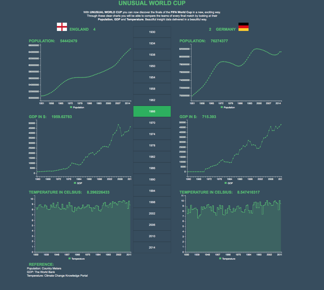
THE WORLD CUP FINALS
I visualised all the World Cup Finals with the two teams and the final score. Then I visualised three different aspects of that nations: Population, GDP and Temperature. So the user can compare the two nations.
A NEW CHAMPION?
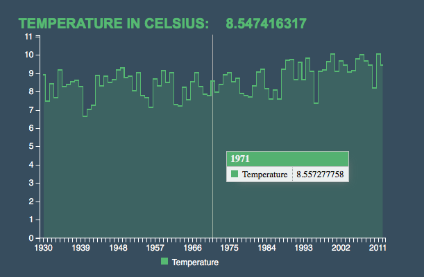
With those Interactive Graphs, the user is able to compare the teams of every final match and see what was their specific Population during the year when the football final was contested. The teams compete even in GDP and in Temperature. Even if a team won the World Cup, maybe it could have lost if you compare the two nations by GDP.
INTERACTIVE VISUALISATION
The user can interact with the visualisation and see the data in a specific year.
He can select a different year and see the two teams that played in that final and visualise with new data.
Project link